working roughs
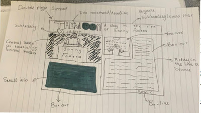
These are my labelled working roughs of the magazine design that I would like my actual magazine to look like roughly. I made these on a piece of A4 paper by drawing the outline of the actual magazine and then drew 3 pages: the front cover, the contents page and a double page spread, then I drew my own design layout for the magazine. I really enjoyed making these because it allowed me to use my imagination to create a rough idea of how I want my final magazine design to look like. After I created these roughs, I then labelled each feature of the magazine with the terminology that describes that feature.


The correct term is visualisation diagram- its a more polished version than thumbnail sketches, these will be of use for you as the person producing the magazine but doesnt include the detail that even you would need to help the development of the magazine- and fairly limiting for anyone else looking at the visualisation diagrams, the purpose of a visualisation diagram is to show in detail the planned outcomes. these will be of some use for you as the person producing the magazine but doesnt include the detail that even you would need to help the development of the magazine- and fairly limiting for anyone else looking at the visualisation diagrams, the purpose of a visualisation diagram is to show in detail the planned outcomes.
ReplyDelete